
- Training
- Service
- Promotion
- Schedule
- Testing Center
- News
- Contact
8/19/2022


Use Power BI

Now that we've introduced the basics of Microsoft Power BI, let's jump into some hands-on experiences and a guided tour.
The activities and analyses that you'll learn with Power BI generally follow a common flow. The common flow of activity looks like this:
.png)
As mentioned earlier, you might spend all your time in the Power BI service, viewing visuals and reports that have been created by others. And that's fine. Someone else on your team might spend their time in Power BI Desktop, which is fine too. To help you understand the full continuum of Power BI and what it can do, we'll show you all of it. Then you can decide how to use it to your best advantage.
So, let's jump in and step through the experience. Your first order of business is to learn the basic building blocks of Power BI, which will provide a solid basis for turning data into cool reports and visuals.
Everything you do in Microsoft Power BI can be broken down into a few basic building blocks. After you understand these building blocks, you can expand on each of them and begin creating elaborate and complex reports. After all, even seemingly complex things are built from basic building blocks. For example, buildings are created with wood, steel, concrete and glass, and cars are made from metal, fabric, and rubber. Of course, buildings and cars can also be basic or elaborate, depending on how those basic building blocks are arranged.
Here are the basic building blocks in Power BI:
A visualization (sometimes also referred to as a visual) is a visual representation of data, like a chart, a color-coded map, or other interesting things you can create to represent your data visually. Power BI has all sorts of visualization types, and more are coming all the time. The following image shows a collection of different visualizations that were created in Power BI.
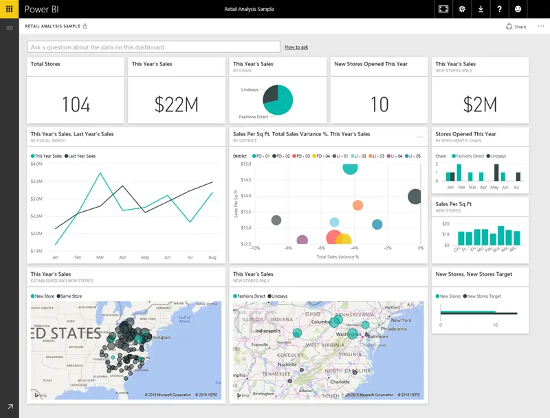
Visualizations can be simple, like a single number that represents something significant, or they can be visually complex, like a gradient-colored map that shows voter sentiment about a certain social issue or concern. The goal of a visual is to present data in a way that provides context and insights, both of which would probably be difficult to discern from a raw table of numbers or text.
A dataset is a collection of data that Power BI uses to create its visualizations.
You can have a simple dataset that's based on a single table from a Microsoft Excel workbook, similar to what's shown in the following image.
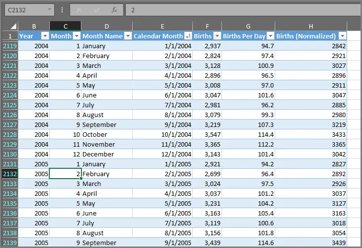
Datasets can also be a combination of many different sources, which you can filter and combine to provide a unique collection of data (a dataset) for use in Power BI.
For example, you can create a dataset from three database fields, one website table, an Excel table, and online results of an email marketing campaign. That unique combination is still considered a single dataset, even though it was pulled together from many different sources.

Filtering data before bringing it into Power BI lets you focus on the data that matters to you. For example, you can filter your contact database so that only customers who received emails from the marketing campaign are included in the dataset. You can then create visuals based on that subset (the filtered collection) of customers who were included in the campaign. Filtering helps you focus your data—and your efforts.
An important and enabling part of Power BI is the multitude of data connectors that are included. Whether the data you want is in Excel or a Microsoft SQL Server database, in Azure or Oracle, or in a service like Facebook, Salesforce, or MailChimp, Power BI has built-in data connectors that let you easily connect to that data, filter it if necessary, and bring it into your dataset.
After you have a dataset, you can begin creating visualizations that show different portions of it in different ways, and gain insights based on what you see. That's where reports come in.
In Power BI, a report is a collection of visualizations that appear together on one or more pages. Just like any other report you might create for a sales presentation or write for a school assignment, a report in Power BI is a collection of items that are related to each other. The following image shows a report in Power BI Desktop—in this case, it's the second page in a five-page report. You can also create reports in the Power BI service.
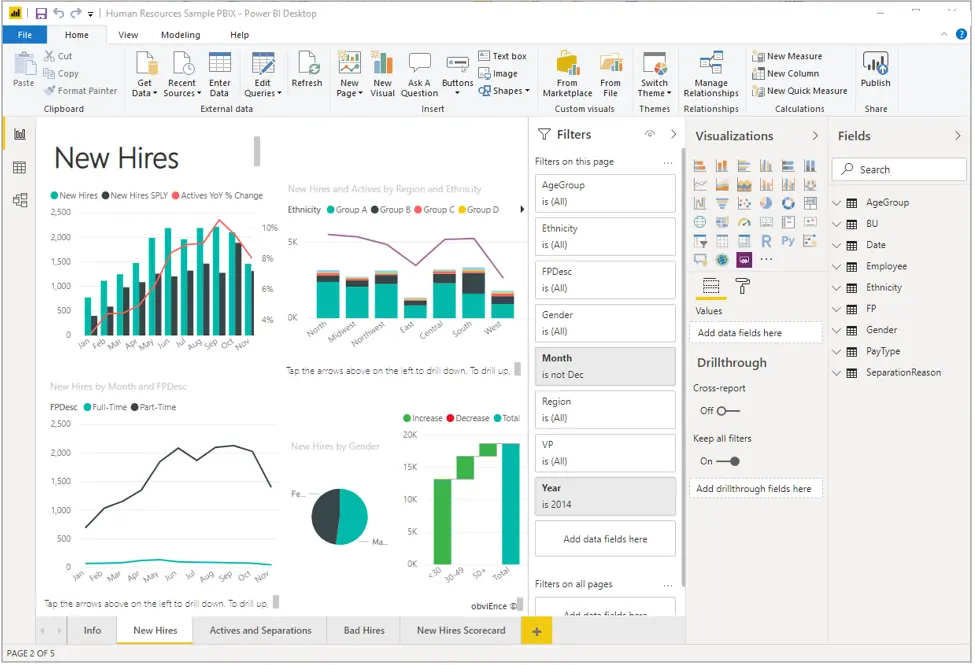
Reports let you create many visualizations, on multiple pages if necessary, and let you arrange those visualizations in whatever way best tells your story.
You might have a report about quarterly sales, product growth in a particular segment, or migration patterns of polar bears. Whatever your subject, reports let you gather and organize your visualizations onto one page (or more).
When you're ready to share a report, or a collection of visualizations, you create a dashboard. Much like the dashboard in a car, a Power BI dashboard is a collection of visuals that you can share with others. Often, it's a selected group of visuals that provide quick insight into the data or story you're trying to present.
A dashboard must fit on a single page, often called a canvas (the canvas is the blank backdrop in Power BI Desktop or the service, where you put visualizations). Think of it like the canvas that an artist or painter uses—a workspace where you create, combine, and rework interesting and compelling visuals. You can share dashboards with other users or groups, who can then interact with your dashboards when they're in the Power BI service or on their mobile device.
In Power BI, a tile is a single visualization on a dashboard. It's the rectangular box that holds an individual visual. In the following image, you see one tile, which is also surrounded by other tiles.
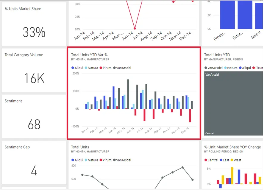
When you're creating a dashboard in Power BI, you can move or arrange tiles however you want. You can make them bigger, change their height or width, and snuggle them up to other tiles.
When you're viewing, or consuming, a dashboard or report—which means you're not the creator or owner, but the report or dashboard has been shared with you—you can interact with it, but you can't change the size of the tiles or their arrangement.
Get data with Power BI Desktop
When you launch Power BI Desktop, the Getting Started dialog box will appear, which provides useful links to forums, blogs, and introductory videos. Close this dialog box for now, but keep the Show this screen on startup option selected so that you can explore it later.
In Power BI Desktop, you'll begin to build reports in the Report view. You'll be working in five main areas:

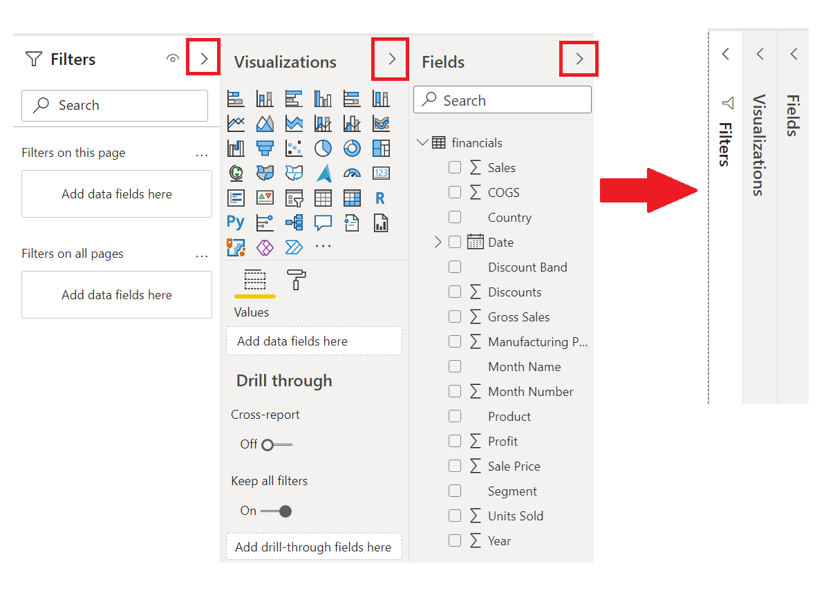
To create a visual, drag a field from the Fields list onto the Report view.

For example, Power BI Desktop automatically created a map-based visualization because it recognized that the Country field contained geolocation data.
After creating a report with a few visuals, you're ready to publish to the Power BI service. On the Home ribbon on the Power BI Desktop, select Publish.
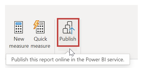
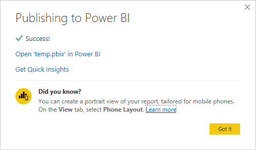
You’ll be prompted to sign in to Power BI. When you've signed in and the publish process is complete, the following dialog box will appear. You can select the link below Success!, which will take you to the Power BI service, where you can see the report that you published.
When you view a published report in the Power BI service, you can choose the Pin icon to pin that visual to a dashboard.

You can choose whether to pin the visual to an existing dashboard or to create a new dashboard.

12/11/2025


