
- Training
- Service
- Promotion
- Schedule
- Testing Center
- News
- Contact
7/5/2023


Explore the key differences and unique features of Power BI dashboards and reports. Learn how to leverage both tools effectively for data analysis, visualization, and decision-making.
Power BI is a powerful business intelligence tool that has transformed the way businesses analyze and share data insights. It has revolutionized decision-making by presenting data in an easily digestible and interactive format, whether it's used by a retail manager tracking inventory turnover or a marketing executive measuring the ROI of the latest campaign.
At the heart of this powerful tool are two fundamental components: Dashboards and Reports.
Both serve unique functions in data analysis and visualization, and understanding their differences is pivotal to leveraging Power BI effectively. In this tutorial, we will delve into the unique features, purposes, and key differences between Power BI dashboards and reports, equipping you with the knowledge to maximize your data's potential and know when to use each.
What are Power BI Dashboards?
Dashboards, in the context of Power BI, are visual displays that provide a consolidated view of data. They allow users to monitor key metrics, track performance, and gain high-level insights at a glance.
In general, dashboards are designed to display data in real-time or near-real-time. They can connect to various data sources, including databases, cloud services, and streaming data, providing up-to-date information.
While different visualizations can be used in dashboards, they focus mainly on charts, graphs, gauges, and cards. These visual elements represent key performance indicators (KPIs) and provide a quick overview of business metrics. Therefore, dashboards are typically limited to a single page, allowing users to see multiple visualizations at once. This simplicity helps users quickly grasp the overall performance of their business.
In addition, dashboard interactivity is limited to keep things simple.
Publishing a dashboard to Power BI Service even allows developers to fix certain filters or visual elements for a set of end users.
As a result, you will consult dashboards when a quick analysis is needed on any type of screen, be it a computer monitor, a mobile device, or a screen during a presentation. Keeping how the end user will use the dashboard in mind is vital when designing your visualizations.
What are Power BI Reports?
Power BI reports are comprehensive and detailed pages that provide in-depth analysis and insights. They offer more advanced functionalities compared to dashboards.
Reports enable users to dive deep into data, perform ad-hoc analysis, and explore multiple dimensions. They provide a comprehensive view of data, allowing users to answer complex business questions. This is made possible by offering interactive features such as drill-through, filtering, and highlighting. Users can explore data further by interacting with the visualizations, uncovering deeper insights.
Since so many visuals and other elements are incorporated into reports, it is best to split them across multiple pages or tabs, each containing different visualizations, tables, and interactive elements. Users can navigate between pages to explore specific aspects of the data, by using buttons and bookmarks.
Another technique to declutter your reports is by making use of progressive disclosure: showing the bear necessities as a starting point, but letting users uncover more details by letting them click on buttons that reveal more detailed visuals. This gives the user a more app-like experience.
Because of their complexities, reports support advanced data modeling techniques. Users can create custom measures, calculated columns, and use DAX (Data Analysis Expressions) to perform complex calculations, allowing for performant and efficient displaying of visualizations.
Lastly, reports often focus on historical data, to get a more holistic view of current trends. Therefore, reports may require periodic data updates. Power BI supports scheduled refresh, ensuring the data in the report is refreshed at regular intervals.
Key Similarities and Differences
Similarities
Both dashboards and reports in Power BI are tools designed to visualize and communicate data effectively. They are customizable and allow for a wide range of visualization options, such as charts, graphs, and tables. Additionally, both can connect to a variety of data sources, facilitating data integration for comprehensive analysis.
Differences
|
Dashboards |
Reports |
|||||
| Purpose |
are used for high-level monitoring, often in real-time or near-real-time, providing a consolidated view of business performance. |
are used for in-depth analysis and exploration of data to answer complex business questions. |
||||
| Interactivity |
offer limited interactivity to keep things simple. |
provide a variety of interactive features. These include drill-through, filtering, and highlighting that enable users to delve deeper into the data. |
||||
| Structure |
are typically single-page, with multiple visualizations available at a glance. |
may be multi-page, with different visualizations and data tables split across multiple pages or tabs. |
||||
| Data updates |
are designed for real-time or near-real-time data updates, making them ideal for monitoring live data. |
typically focus on historical data and require periodic updates, with Power BI offering scheduled refresh capabilities. |
||||
| Use case |
are often used for quickly sharing key insights across an organization. |
are more suited for detailed analysis, allowing users to explore specific aspects of the data. |
||||
Practical Examples
To illustrate the differences between Power BI Dashboards and Reports, let's take a look at some practical examples:
Power BI Dashboard Example
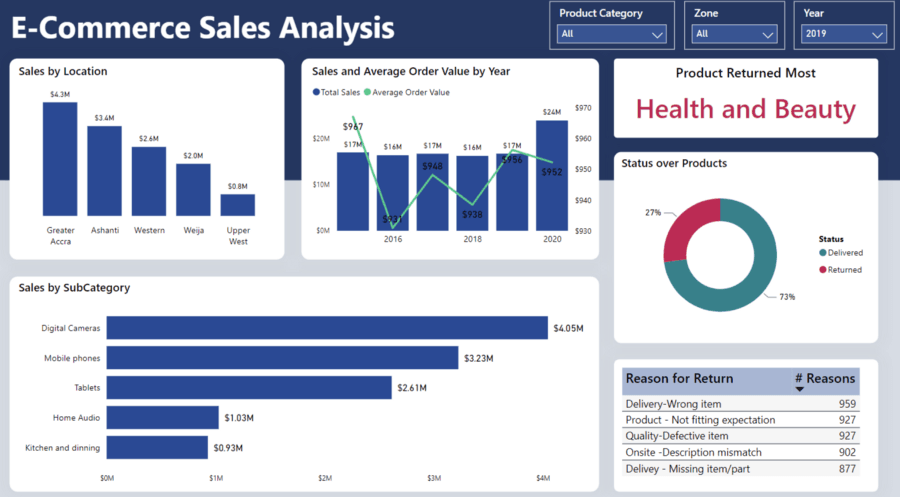
Imagine you are a retail manager who wants to monitor the overall health of your business. Your dashboard might include visualizations showing sales revenue, profit margin, inventory levels, and customer footfall. These KPIs would provide an at-a-glance, real-time view of business performance. Suppose there's a sudden drop in sales revenue; with a well-crafted dashboard, you can immediately spot this and start investigating.
Power BI Report Example
Now let's consider a situation where you want to analyze the impact of a recent promotional campaign on sales. For this, you would turn to a Power BI report. The report could include multiple pages, each showing sales data from different angles - by product, by region, and over time. With interactive elements like drill-through and filtering, you can examine the sales of a particular product in a specific region, and even check how the sales trend changed before, during, and after the promotional period.

Remember, the primary purpose of a dashboard is to provide a real-time consolidated view of business performance, ideal for quick insights and monitoring. On the other hand, reports are designed for detailed, interactive analysis, enabling you to explore data in-depth and answer complex business questions. By considering your data needs and the questions you want to answer, you can determine whether to use a dashboard or report for your analysis.
Source: datacamp.com

12/11/2025


