
- Training
- Service
- Promotion
- Schedule
- Testing Center
- News
- Contact
3/28/2024


Power BI slicers offer flexible, interactive control over the filters in your reports. In this tutorial, we will explore Power BI slicers in detail, how they differ from filters applied in the filter pane, and some best practices for using them in practice.
What Are Power BI Slicers?
Power BI slicers are interactive controls that allow you to filter the data displayed in your reports. They are visual filters that can be placed directly onto a report canvas, enabling users to interact with them to filter visuals displayed on a report page.
There are four types of slicers:
Slicers are highly customizable, with a wide range of formatting options. Slicers can also be synced across different report pages, meaning that a selection on one page's slicer can affect the visuals on other pages.
However, Power BI slicers have some limitations. They do not support input fields, drill-down options, or visual-level filters. Also, you cannot pin a slicer to a dashboard, and they don’t work with measures or aggregated values.
Benefits of Using Slicers vs Filters
Slicers and filters are often confused in Power BI. You can filter your reports in two ways: the slicer visual and the filter pane (found on the right-hand side of your Power BI report).
From my experience, most users do not like the filter pane. It is generally collapsed by default and is not as intuitive to use (compared to slicers). You cannot customize the appearance or functionality of filters. Instead, most users prefer their slicers to be front-and-center and readily available on their reports.
However, that being said, the filter pane is a powerful tool for Power BI report designers and developers. The filter pane allows you to perform advanced filtering using logical operators like greater than, less than, and so on. Filters are most useful when creating bookmarks (together with buttons) and adding drill-through functionality to reports.
A useful feature of Power BI filters is that you can easily apply them at different levels - for a single visual, page, or entire report. This gives you more control over what the user sees in a report.
As you can see, slicers and filters each have pros and cons. Choose the method based on your requirements, and tailor the design of your reports to your users' preferences. Usually, you will find that you use a combination of both, balancing the need for technical, advanced filtering with the simplicity and flexibility of slicers to optimize the user experience.
How to Create Power BI Slicers
To add a slicer to your report, simply choose the slicer visual from the list of visualizations in the right-hand pane of Power BI Desktop. After that, add the fields you want to use to filter your report.
Most customization options for slicers (like titles, font, and background color) are the same as most Power BI visuals. In the rest of this section, we’ll review each of the customization options unique to slicers.
Selection controls
A few options allow you to control how items are selected in a slicer. These are single select, multi-select with CTRL, and whether to show the "Select all" option.

Hierarchy slicers
To save space, you can add multiple fields to a slicer visual to create a hierarchy slicer. This works for both the list and dropdown filters.
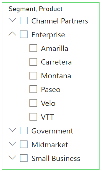
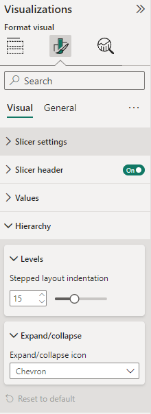
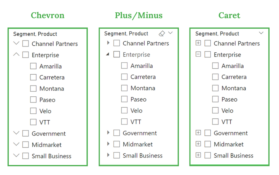
To create a hierarchy slicer, add additional columns to the Fields area. Once you have created a hierarchy, you can also customize the look and feel of the slicer under the Hierarchy options. You can then adjust the indentation of each level of the hierarchy and the icon used to expand or collapse the hierarchy.
Excluding items from a slicer
You can easily remove items you do not wish to appear in a slicer.
Right-click the item in the slicer you want to remove, and select Exclude.
You can verify which items have been removed by hovering over the 'Applied filters' icon on the top right-hand corner of the slicer. All excluded (and filtered) items will show up here.

You can also hide certain filters or exclusions so they do not appear under the 'Applied filters' list. To do this, click the show/hide icon in the filters pane on the right-hand side of the report. You can also easily clear the exclusion from the filter pane by removing that filter.

Syncing slicers
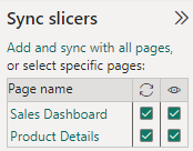
You can sync up slicers between the pages in your report by enabling the ‘Sync slicers’ pane from the ribbon.

This can be a big time-saver if you tend to have the same slicers across multiple pages in your report - such as a date slicer - so that when a user selects a certain date range on one page, the same date range is automatically applied to the other date slicers throughout the report.
Customizing slicer interactions
Using the 'Edit interactions' feature in the ribbon, you can specify which visuals a slicer can filter. This gives you far more control over your report.

For example, if you want to compare the sales performance of two stores, you can divide your canvas in half and present the same visuals on either side with slicers that only filter the visuals on their own side.
Slicers have two options when editing their interactions with other visuals:

Best Practices for Using Slicers
Using slicers in Power BI is a fantastic way to make your reports more interactive and user-friendly. However, it's important to follow some best practices to get the most out of them and ensure your reports remain performant and easy to use.
1. Not all filters need to be slicers
Frequently used filters make good candidates for slicers, while you can move less critical ones to the Filter Pane. This helps keep your report clean and focused on the most important.
2. Placement matters
Group your slicers together and position them where they feel natural and intuitive for the report viewers, such as the top, left, or right side of a report page. Consider using bookmarks to hide slicers when not in use, optimizing the space on your report.
Slicers should be positioned to feel natural to those viewing the report. Yet, slicer choice and positioning that may work for your visual design may not always be optimal for users. Find a balance that provides the best user experience that will make slicers available while not distracting from the core visualizations on the page.
3. Manage slicer performance
Slicers can impact report performance, especially when used extensively. To mitigate this, consider using the "Add an Apply button" option for slicers to delay query evaluation and refreshing of the visuals until the user is ready. This can significantly improve the user experience in reports with complex data models or large datasets.
In the Power BI options, you can add an Apply button to each slicer so that changes to slicer selections are only applied when the user clicks the Apply button. This reduces the frequency of queries sent.
Reducing the number of queries improves report performance, especially when dealing with complex reports and large datasets.
4. Limit slicer values
To improve report performance, limit the number of values in your slicers. This can reduce the load time of your report and make it more responsive.
Conclusion
Power BI slicers are a great way to provide flexible and interactive control over your reports. They are highly customizable and have some really useful features, like the ability to sync them across report pages and edit how they interact with other visuals. Slicers are more intuitive than filters and sit front and center in your reports, leading to a better user experience.
Source: datacamp.com

12/11/2025


